This visualisation in R displays the origins and destinations of players participating in the 2015 NBA Draft using Sankey diagrams.
A Sankey diagram is a visualisation used to depict a flow from one set of values to another. The things being connected are called nodes and the connections are called links. Sankeys are best used when you want to show a many-to-many mapping between two domains (e.g., organisation type and organisation name) or multiple paths through a set of stages (colleges and NBA teams).
This Sankey diagram shows the origins of the 2015 NBA rookies using draft data from stats.nba.com. I start by pulling 2015 draft data from stats.nba.com, using the same approach I used in this previous post.
library(rjson)
library(RCurl)

# 2015 Draft data
draftURL <- paste("http://stats.nba.com/stats/drafthistory?College=&LeagueID=00&OverallPick=&RoundNum=&RoundPick=&Season=2015&TeamID=0&TopX=", sep = "")

# import draft data from JSON
draftData <- fromJSON(file = draftURL, method="C")
# unlist shot data, save into a data frame
draft <- data.frame(matrix(unlist(draftData$resultSets[[1]][[3]]), ncol=12, byrow = TRUE))
# shot data headers
colnames(draft) <- draftData$resultSets[[1]][[2]]
After getting the data the next step is to summarise it. The data must contain 3 columns: origin, destination and a measure (in this case the number of players). I use the package sqldf to manipulate the data.
# summarise data
library(sqldf)
draftSankey <- sqldf("SELECT ORGANIZATION_TYPE, ORGANIZATION, COUNT(PLAYER_NAME) AS PLAYERS
     FROM draft
     GROUP BY 1,2
    UNION ALL
     SELECT ORGANIZATION, (TEAM_CITY||' '||TEAM_NAME) AS NBA_TEAM, COUNT(PLAYER_NAME) AS PLAYERS
     FROM draft
     GROUP BY 1,2")
The first sql statement groups the organisation type (High School, College or International Club), organisation name and number of players. This is then merged with the second sql statement that groups organisation name, NBA team and number of players.
Once the data is in the right format, I use googleVis to generate the first Sankey diagram:
# Sankey diagram using googleVis
library(googleVis)
plot(gvisSankey(draftSankey, from="ORGANIZATION", to="NBA_TEAM", weight="PLAYERS",
    options=list(height=800, width=850,
    sankey="{
     link:{color:{fill: 'lightgray', fillOpacity: 0.7}},
     node:{nodePadding: 5, label:{fontSize: 12}, interactivity: true, width: 20},
   }")
  )
)
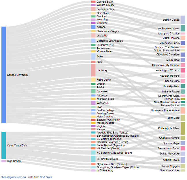
In this diagram you can easily visualise origins and destinations by clicking in each college or team. For example, in 2015 Kentucky has provided a total of 6 players to NBA teams: 2 went to Phoenix while Oklahoma, Sacramento, Minnesota and Utah received 1 player each.

It is also possible to highlight a final destination (NBA team) such as the Philadelphia 76ers and visualise where their Rookies came from in 2015. International clubs provided 3 players while other 3 came from Duke, Bowling Green and North Carolina.


Fantastic use of the platform. Beautifully simple, thanks for sharing!
LikeLike
[…] NBA Draft Visualization […]
LikeLike
This is awesome, and I love that you’re including all the delicious R code! Great use of Sankey to boot!
LikeLike