A while ago I found this fantastic post about NBA shot charts built in Python. Since my Python skills are quite basic I decided to reproduce such charts in R using data scraped from the internet and ggplot2.
Getting the Data
First we need the shot data from stats.nba.com. This blog post from Greg Reda does a great job explaining how to find the underlying API and extract data from a web app (in this case, stats.nba.com).
To get shot data for Stephen Curry we will use this url. The url shows the shots taken by Curry during the 2014-15 regular season in a JSON structure. Note also that Season, SeasonType and PlayerID are parameters in the url. Stephen Curry’s PlayerID is 201939.
Time to get this data into R and for that I use the package rjson and replace the PlayerID parameter with the R object PlayerID.
UPDATE: the NBA stats website has changed the JSON structure of its shot detail data. In this code, I added the new argument PlayerPosition and it should work just fine.
library(rjson)
# shot data for Stephen Curry
playerID <- 201939
shotURL <- paste("http://stats.nba.com/stats/shotchartdetail?CFID=33&CFPARAMS=2014-15&ContextFilter=&ContextMeasure=FGA&DateFrom=&DateTo=&GameID=&GameSegment=&LastNGames=0&LeagueID=00&Location=&MeasureType=Base&Month=0&OpponentTeamID=0&Outcome=&PaceAdjust=N&PerMode=PerGame&Period=0&PlayerID=",playerID,"&PlayerPosition=&PlusMinus=N&Position=&Rank=N&RookieYear=&Season=2014-15&SeasonSegment=&SeasonType=Regular+Season&TeamID=0&VsConference=&VsDivision=&mode=Advanced&showDetails=0&showShots=1&showZones=0", sep = "")
# import from JSON
shotData <- fromJSON(file = shotURL, method="C")
Now we have the JSON data as a R list object with 3 elements. The element important for the chart is the resultSets which contains the coordinates of each shot, shot type, range, made/missed flag and more. But first the data needs to be unlisted and saved as a data frame.
# unlist shot data, save into a data frame
shotDataf <- data.frame(matrix(unlist(shotData$resultSets[[1]][[3]]), ncol=24, byrow = TRUE))

# shot data headers
colnames(shotDataf) <- shotData$resultSets[[1]][[2]]

# covert x and y coordinates into numeric
shotDataf$LOC_X <- as.numeric(as.character(shotDataf$LOC_X))
shotDataf$LOC_Y <- as.numeric(as.character(shotDataf$LOC_Y))
shotDataf$SHOT_DISTANCE <- as.numeric(as.character(shotDataf$SHOT_DISTANCE))

# have a look at the data
View(shotDataf)
Basic Chart
We can now produce a basic plot using ggplot2.
# simple plot using EVENT_TYPE to colour the dots
ggplot(shotDataf, aes(x=LOC_X, y=LOC_Y)) +
         geom_point(aes(colour = EVENT_TYPE))
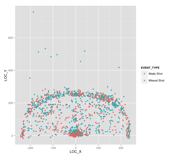
This plot surely looks familiar. But it can improved by overlaying a basketball half court and fixing the aspect ratio of our court/plot. To solve the basketball court problem I simply googled “NBA half court” and found this. (EDIT: the jpg court file is no longer there. Instead, use this)
Shot Charts
Lets plot the data again but this time using the image overlay. For that I will use the packages grid and jpeg. The image is overlaid by using the ggplot2 function annotation_custom. For the axis limits I use -250 to 250 in axis x and -50 to 420 in axis y (I found these to be a good fit after a few hit-and-misses). These dimensions are also the exact length to width ratio of an official NBA half court, but they might differ if you use a different half court image.
library(grid)
library(jpeg)

# half court image
courtImg.URL <- "https://thedatagame.files.wordpress.com/2016/03/nba_court.jpg"
court <- rasterGrob(readJPEG(getURLContent(courtImg.URL)),
           width=unit(1,"npc"), height=unit(1,"npc"))

# plot using NBA court background and colour by shot zone
ggplot(shotDataf, aes(x=LOC_X, y=LOC_Y)) +
      annotation_custom(court, -250, 250, -50, 420) +
      geom_point(aes(colour = SHOT_ZONE_BASIC, shape = EVENT_TYPE)) +
      xlim(-250, 250) +
      ylim(-50, 420)
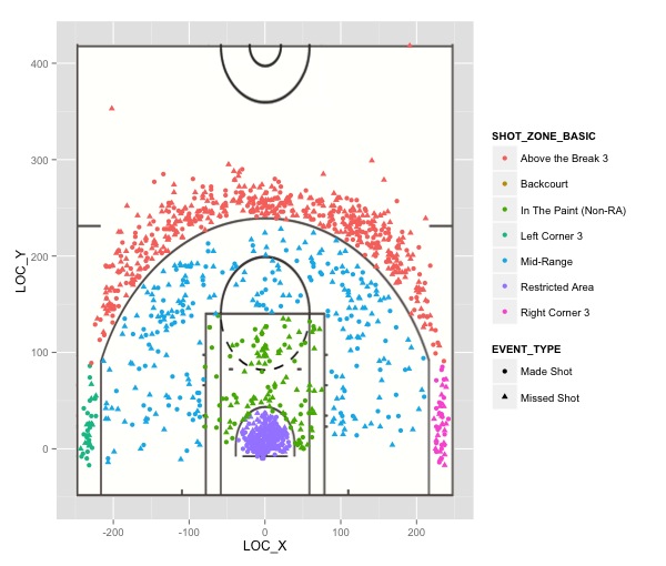
There are a few things to note here. First you may see an error that reads “Removed 7 rows containing missing values (geom_point)“. In this case, Stephen Curry attempted 7 backcourt shots during the final seconds of a quarter. I am not interested in these shots and as a result of my y-axis limits, these are not going to be displayed. Secondly, note how shots labeled as “Left Corner 3” in green are actually located on the right side of the court. I will solve this problem by flipping the x-axis from left to right. One more thing: the coordinates are not fixed. As we resize the plot, it becomes distorted. This can be solved by using the coord_fixed function.
# plot using ggplot and NBA court background image
ggplot(shotDataf, aes(x=LOC_X, y=LOC_Y)) +
       annotation_custom(court, -250, 250, -50, 420) +
       geom_point(aes(colour = SHOT_ZONE_BASIC, shape = EVENT_TYPE)) +
       xlim(250, -250) +
       ylim(-50, 420) +
       geom_rug(alpha = 0.2) +
       coord_fixed() +
       ggtitle(paste("Shot Chart\n", unique(shotDataf$PLAYER_NAME), sep = "")) +
       theme(line = element_blank(),
             axis.title.x = element_blank(),
             axis.title.y = element_blank(),
             axis.text.x = element_blank(),
             axis.text.y = element_blank(),
             legend.title = element_blank(),
             plot.title = element_text(size = 15, lineheight = 0.9, face = "bold"))

This is a much improved shot chart. The x-axis is now flipped, right corner shots appear on the right of the court and left corner shots appear on the left of the court. Coordinates have been fixed meaning that no matter how the chart is resized, the court maintains its true aspect ratio. The axis and legend titles have disappeared and a title for the plot, containing the name of the player, has been added. One cool aesthetic and informative feature in this plot are the rugs on each axis created by geom_rug. It works as a density plot and a guide of “hot zones” for each player.
Adding Player Picture
It is also possible to scrape player pictures as pointed out by Savvas Tjortjoglou in his post. Stephen Curry’s picture can be found at http://stats.nba.com/media/players/132×132/201939.png where 201939 is Curry’s PlayerID. I will also make a few changes to the geom_point settings.
library(grid)
library(gridExtra)
library(png)
library(RCurl)

# scrape player photo and save as a raster object
playerImg.URL <- paste("http://stats.nba.com/media/players/132x132/",playerID,".png", sep="")
playerImg <- rasterGrob(readPNG(getURLContent(playerImg.URL)),
													width=unit(0.15, "npc"), height=unit(0.15, "npc"))

# plot using ggplot and NBA court background
ggplot(shotDataf, aes(x=LOC_X, y=LOC_Y)) +
	annotation_custom(court, -250, 250, -52, 418) +
	geom_point(aes(colour = EVENT_TYPE, alpha = 0.8), size = 3) +
	scale_color_manual(values = c("#008000", "#FF6347")) +
	guides(alpha = FALSE, size = FALSE) +
	xlim(250, -250) +
	ylim(-52, 418) +
	geom_rug(alpha = 0.2) +
	coord_fixed() +
	ggtitle(paste("Shot Chart\n", unique(shotDataf$PLAYER_NAME), sep = "")) +
	theme(line = element_blank(),
		axis.title.x = element_blank(),
		axis.title.y = element_blank(),
		axis.text.x = element_blank(),
		axis.text.y = element_blank(),
		legend.title = element_blank(),
		plot.title = element_text(size = 17, lineheight = 1.2, face = "bold"))

# add player photo and footnote to the plot
pushViewport(viewport(x = unit(0.9, "npc"), y = unit(0.8, "npc")))
	print(grid.draw(playerImg), newpage=FALSE)
	grid.text(label = "thedatagame.com.au", just = "centre", vjust = 50)

This time I highlighted shots made in green and shots missed in red. I also added transparency to each points by using alpha = 0.8. The player photo and the footnote were added using functions from package grid.
Hexbin Shot Charts
Another cool way to display data with ggplot2 is to use hexbin instead of geom_point. You will need to install and load the package hexbin and use the function stat_binhex (which replaces geom_point and its components).
library(hexbin)

# plot shots using ggplot, hex bins, NBA court backgroung image.
ggplot(shotDataf, aes(x=LOC_X, y=LOC_Y)) +
	annotation_custom(court, -250, 250, -52, 418) +
	stat_binhex(bins = 25, colour = "gray", alpha = 0.7) +
	scale_fill_gradientn(colours = c("yellow","orange","red")) +
	guides(alpha = FALSE, size = FALSE) +
	xlim(250, -250) +
	ylim(-52, 418) +
	geom_rug(alpha = 0.2) +
	coord_fixed() +
	ggtitle(paste("Shot Chart\n", unique(shotDataf$PLAYER_NAME), sep = "")) +
	theme(line = element_blank(),
		axis.title.x = element_blank(),
		axis.title.y = element_blank(),
		axis.text.x = element_blank(),
		axis.text.y = element_blank(),
		legend.title = element_blank(),
		plot.title = element_text(size = 17, lineheight = 1.2, face = "bold"))

# add player photo and footnote to the plot
pushViewport(viewport(x = unit(0.9, "npc"), y = unit(0.8, "npc")))
	print(grid.draw(playerImg), newpage=FALSE)
	grid.text(label = "thedatagame.com.au", just = "centre", vjust = 50)
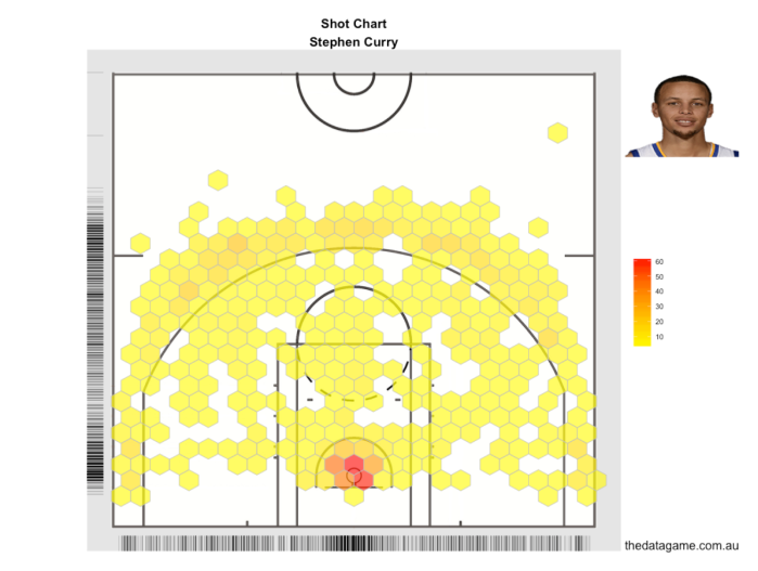
We know that Stephen Curry is an excellent 3-point shooter. In fact, he has taken 639 out of 1,341 shots from above the 3-line (left, right and centre). But this chart also reveals how active he is under the rim: 284 shots were attempted deep inside the paint, most of them were driving lay-up shots originated from Curry’s lighting fast transitions from defence all the way to the basket.
Accuracy Charts
Now I will have a look at shot accuracy for each of the 6 zones in the data (excluding backcourt shots). After excluding these shots, the data is summarised by shot zones using ddply. X and Y locations are averaged, shots made are summed up and attempted shots are counted and aggregated. I also create a column for accuracy labels. Again, I use ggplot along with geom_point for points location and geom_text for labels locations.
# exclude backcourt shots
shotDataS <- shotDataf[which(!shotDataf$SHOT_ZONE_BASIC=='Backcourt'), ]

# summarise shot data
library(plyr)
shotS <- ddply(shotDataS, .(SHOT_ZONE_BASIC), summarize,
		SHOTS_ATTEMPTED = length(SHOT_MADE_FLAG),
		SHOTS_MADE = sum(as.numeric(as.character(SHOT_MADE_FLAG))),
		MLOC_X = mean(LOC_X),
		MLOC_Y = mean(LOC_Y))

# calculate shot zone accuracy and add zone accuracy labels
shotS$SHOT_ACCURACY <- (shotS$SHOTS_MADE / shotS$SHOTS_ATTEMPTED)
shotS$SHOT_ACCURACY_LAB <- paste(as.character(round(100 * shotS$SHOT_ACCURACY, 1)), "%", sep="")

# plot shot accuracy per zone
ggplot(shotS, aes(x=MLOC_X, y=MLOC_Y)) +
	annotation_custom(court, -250, 250, -52, 418) +
	geom_point(aes(colour = SHOT_ZONE_BASIC, size = SHOT_ACCURACY, alpha = 0.8), size = 8) +
	geom_text(aes(colour = SHOT_ZONE_BASIC, label = SHOT_ACCURACY_LAB), vjust = -1.2, size = 8) +
	guides(alpha = FALSE, size = FALSE) +
	xlim(250, -250) +
	ylim(-52, 418) +
	coord_fixed() +
	ggtitle(paste("Shot Accuracy\n", unique(shotDataf$PLAYER_NAME), sep = "")) +
	theme(line = element_blank(),
		axis.title.x = element_blank(),
		axis.title.y = element_blank(),
		axis.text.x = element_blank(),
		axis.text.y = element_blank(),
		legend.title = element_blank(),
		legend.text=element_text(size = 12),
		plot.title = element_text(size = 17, lineheight = 1.2, face = "bold"))

# add player photo and footnote to the plot
pushViewport(viewport(x = unit(0.9, "npc"), y = unit(0.8, "npc")))
	print(grid.draw(playerImg), newpage=FALSE)
	grid.text(label = "thedatagame.com.au", just = "centre", vjust = 50)

Note how the “Above the Break 3” point is located inside the 3-point line area. This is because the 3-point shots attempted from the corners drive the y-axis average location down close to the basket. You can adjust the y-axis by adding, lets say, 20 to shotS$MLOC_Y for “Above the Break 3” . But I will leave as is.
Now, the same accuracy chart for James Harden from the Houston Rockets.

Curry isn’t the 2014-15 MVP by chance. He made 48.7% of field goals attempted during the regular season. From the left 3-point corner, he converted 63.2% of shots attempted (almost 2 in every 3 attempts). Under the rim Curry is very effective with 66.5% accuracy when going for those quick lay-ups and finger rolls.
James Harden, the other MVP contender, is also a great 3-point shooter, but not as accurate as Curry. Harden is slightly better from the right 3-point corner but Curry is better from every other zone in the court.
You can find the code on my GitHub page. I also uploaded a list of 490 player ID’s and players who have available shot location data in the NBA stats web app. All you need to do is replace the object PlayerID with the ID of the player you would like to plot.

when I try to draw the court with your code, my r studio said that getURL function doesn’t exist, do you know why?
LikeLiked by 1 person
getURLis a function of the packageRCurl. Check if the package has been installed without issues.If it doesn’t work, you can download the image and load from your hard drive using this:
LikeLiked by 1 person
Wow, impressive work! I learned a number of new things from that (Hexbin is sweeeet)! Thanks for sharing!
LikeLiked by 1 person
How can I change a scale in hexbin?
From 0-100 to for example 0- 70
LikeLike
If you play around with
binwidthandbins(number of bins) the scale will also change.Example:
LikeLiked by 2 people
I wonder if the data includes the number of seconds remaining in the shot clock. If so, some mapping of that might be plotted as a symbol size.
LikeLike
Yes, the data does include the time remaining in the shot clock. Good idea.
LikeLike
Great post – it would be really interesting to see the hexbin chart with accuracy as well as number of shots – probably you will want to adjust the size of the hexbins so that you see a relatively smooth output.
LikeLike
Hi,
I loved the post! Ed,would you be able to explain how to obtain the JSON data from the internet. Meaning, how do you know the URL that you used?
Thanks so much!
Josh
LikeLike
Hi Josh,
I followed these steps from Greg Reda’s post. You basically need to start the developer tools in Chrome and go to the page that has the data you are looking for.
LikeLike
Perfect tutorial. Thanks.
LikeLike
[…] How to create NBA shot charts in R, Eduardo Maia provides a step-by-step tutorial for using R data frames to visualize shots and […]
LikeLike
How can I create a defensive shot chart?
LikeLike
A good place to start would be the defensive stats page.
Or another idea is to flag defender distance for each shot plotted on the shot chart.
LikeLike
I enjoyed this tutorial, as I am a big fan of NBA and am currently starting to learn R. I have one question though. How did you find URL that contains all data about Curry’s shots? I’ve been trying to scoop around NBA.com’s website but I only managed to find the game logs from each player, I didn’t find statistics such as the ones you used. Is there a link somewhere on the NBA.com’s website so that I can fetch data about every player easily, or do I have to type in URL as some sort of query to retrieve the stats?
LikeLike
I followed these steps from Greg Reda’s post. You basically need to start the developer tools in Chrome and go to the page that has the data you are looking for.
LikeLike
Oh I have discovered that method already, but I was wondering which page contains data that you used? Since it seems I cannot find this specific data for each player.
LikeLike
I went to Steph Curry’s shot tracking page. Then I started the developer tool in Chrome (More Tools -> Developer). Now you have to refresh the page. The click on the “Network” tab and select “XHR”. At this point you have a few options and it is a “hit and miss” process.
Note that this data is for 2015-16 season. But if you change this parameter for last season, you will get all shots for last regular season.
EDIT:
This is what Steph Curry’s shot log page looks like. Note the request URL highlighted under the developer tools in Chrome.
EDIT 2:
The link that contains shot location has
resource = shotchartdetailand notplayerdashptshotloghttp://stats.nba.com/stats/shotchartdetail?CFID=33&CFPARAMS=2015-16&ContextFilter=&ContextMeasure=FGA&DateFrom=&DateTo=&GameID=&GameSegment=&LastNGames=0&LeagueID=00&Location=&MeasureType=Base&Month=0&OpponentTeamID=0&Outcome=&PaceAdjust=N&PerMode=PerGame&Period=0&PlayerID=201939&PlusMinus=N&Position=&Rank=N&RookieYear=&Season=2015-16&SeasonSegment=&SeasonType=Regular+Season&TeamID=0&VsConference=&VsDivision=&mode=Advanced&showDetails=0&showShots=1&showZones=0
LikeLiked by 1 person
Thanks for you post. Very cool stuff. I’ve been trying to read in some data off of the shot logs page, but some values are recorded as nulls when I take the data from the webpage. As a result, when I try to turn the data into a dataframe, my columns don’t line up because of the missing values in the raw data. Any idea on how to remedy this?
LikeLike
What are the columns with null data? Try to replace the season parameter in the URL: 2014-15 instead of 2015-16. If you are still having issues, check your
unlistfunction.LikeLike
Looking at the shot log page. http://stats.nba.com/player/#!/1938/tracking/shotslogs/ The blanks in the shot clock column are represented as nulls in when you look at the data in the developer tab. When I read it into R, it skips over that null value instead of inserting a blank or NA. Everything is fine until I get to that first blank.
LikeLike
The shot clock column in the shot logs page http://stats.nba.com/player/#!/1938/tracking/shotslogs/ the data reads in fine until it gets to one of the blanks.
LikeLike
This is a tricky one. I’ve done some research on how to turn NULL into NA in a list but no success.
LikeLike
Thanks for the post
I would like to point out that the link in the json only contains the shot locations this is not provide in a viewable table on the website
its a easter egg.
LikeLiked by 1 person
Here is the problem I had the link you posted in the picture and the data used from Greg Rada does not work for some reason you use the link
http://stats.nba.com/stats/playerdashptshotlog?DateFrom=&DateTo=&GameSegment=&LastNGames=0&LeagueID=00&Location=&Month=0&OpponentTeamID=0&Outcome=&Period=0&PlayerID=200752&Season=2015-16&SeasonSegment=&SeasonType=Regular+Season&TeamID=0&VsConference=&VsDivision=
then you add
&mode=Advanced&showDetails=0&showShots=1&showZones=0
where did you get extra code used in you link
when i added your extra link the code works great this link uses the id for rudy gay the player i am trying to profile.
this would be of great help for understanding and to end confusion
LikeLike
So, just to clarify:
There are two links: one will give you details on dribbles, closest defender, defender distance, tiuch time… but not the shot location
This link has resource = playerdashptshotlog
Steph Curry example:
http://stats.nba.com/stats/playerdashptshotlog?DateFrom=&DateTo=&GameSegment=&LastNGames=0&LeagueID=00&Location=&Month=0&OpponentTeamID=0&Outcome=&Period=0&PlayerID=201939&Season=2015-16&SeasonSegment=&SeasonType=Regular+Season&TeamID=0&VsConference=&VsDivision=&mode=Advanced&showDetails=0&showShots=1&showZones=0
The link that contains shot location has resource = shotchartdetail
http://stats.nba.com/stats/shotchartdetail?CFID=33&CFPARAMS=2015-16&ContextFilter=&ContextMeasure=FGA&DateFrom=&DateTo=&GameID=&GameSegment=&LastNGames=0&LeagueID=00&Location=&MeasureType=Base&Month=0&OpponentTeamID=0&Outcome=&PaceAdjust=N&PerMode=PerGame&Period=0&PlayerID=201939&PlusMinus=N&Position=&Rank=N&RookieYear=&Season=2015-16&SeasonSegment=&SeasonType=Regular+Season&TeamID=0&VsConference=&VsDivision=&mode=Advanced&showDetails=0&showShots=1&showZones=0
LikeLike
I noticed the NBA court image is no longer hosted in the website I referred above. You can use this link to get the same image: https://thedatagame.files.wordpress.com/2016/03/nba_court.jpg
LikeLike
Ed, quick question. I wanted to treat the season variable the same way you did with playerID. Is there any easy way to do this?
LikeLike
Hi John,
You can create an argument seasonID in the beginning of the code and insert that argument in the URL.
It will look something like this:
# shot data for Stephen Curry playerID <- 201939 seasonID <- '2014-15' shotURL <- paste("http://stats.nba.com/stats/shotchartdetail?CFID=33&CFPARAMS=2015-16&ContextFilter=&ContextMeasure=FGA&DateFrom=&DateTo=&GameID=&GameSegment=&LastNGames=0&LeagueID=00&Location=&MeasureType=Base&Month=0&OpponentTeamID=0&Outcome=&PaceAdjust=N&PerMode=PerGame&Period=0&PlayerID=",playerID,"&PlusMinus=N&Position=&Rank=N&RookieYear=&Season=",seasonID,"&SeasonSegment=&SeasonType=Regular+Season&TeamID=0&VsConference=&VsDivision=&mode=Advanced&showDetails=0&showShots=1&showZones=0", sep = "")LikeLike
[…] by Savvas Tjortjoglou and Eduardo Maia about making NBA shot charts in Python and R, respectively, served as useful resources. Many of […]
LikeLike
Hi Ed, this has been very helpful. Though I have a question – when recreating the shot charts the hexagons and plot points look very pixelated and wonky unlike yours which seem pretty smooth. Any idea why this could be happening?
LikeLike
I ran these plot using the latest version of RStudio and ggplot2, in a Mac. I notice that when I ran the same plot in Windows, it looks a little more pixelated (not a lot!). Have a go at updating RStudio and ggplot2.
LikeLike
Cheers, Ed. Seems like a lower quality is the norm for Windows. Apparently there is some anti-aliasing trickery that would fix it.
LikeLike
Thanks for the tutorial! This was really great. I was able to find a GSW court online to give the shot chart a little something extra: http://jamesmccammon.com/2016/03/26/steph-curry-is-awesome/
LikeLike
[…] Here is Curry’s shot chart so far this season (using data from stats.NBA.com and this tutorial from The Data Game): […]
LikeLike
Excellent work! But could you specify the code on how to filter the shots data of the restricted area when ploting heatmap? Very appreciate it.
LikeLike
There are a few ways to do this. Look at the subset function in R and the SHOT_ZONE_BASIC column
LikeLiked by 1 person
Any tips on how to have the gradient for the hex bins be tied to the FG% rather than the shot frequency?
LikeLike
Hi Mike,
Try this:
scale_fill_gradientn(colours = c("yellow","orange","red"), values = shotDataf$SHOT_DISTANCE)Where values is the value used to colour the hex’s. If you use FG% then you first have to calculate the % per region.
LikeLike
Hi Ed, is it possible to have the Hex bins display accuracy for the player compared to a league standard. For example, if a particular player shoots above the league average for a certain Hex bin area, this Hex bin will be shaded red; and if a player shoots below the league average for a certain Hex bin area, this Hex bin will be shaded blue.
I suppose a starting point would be determining the accuracy for each Hex bin area, and then also obtaining the data for the whole league?
Thanks
LikeLike
Yes, the tricky part here is to calculate the accuracy for each hex bin area. The size of the hex bin area is variable as it depends on the number of bins you use.
But once you have the value you can use the following:
scale_fill_gradientn(colours = c("yellow","orange","red"), values = shotDataf$SHOT_DISTANCE)Where
valuesis the value use to colour the hex bins. Here I use shot distance as an example.LikeLike
I found that stat_hexbin does what I want it to for the mean relative to other hexes for Kobe alone.
LikeLike
I really enjoyed this tutorial, great job!
I do have an issue I’m encountering. I am trying to follow your steps for scraping the data, but whenever I try to load the stats.nba.com page for a given player’s ‘shotslogs’ (ex. “http://stats.nba.com/player/#!/201939/tracking/shotslogs/”, it loads the rest of the page briefly and then just gets stuck with a loading widget in the middle of the screen (on both Firefox and Chrome). Since it wont load any of that player’s data, the only thing I’m left to scrape from is a page that lists all NBA players in the database, and that’s not useful because it doesn’t come with any of the shooting data for any of the players anyhow. I’m hoping that this is just something that’s happening on NBA.com’s end. I’d like to get 2015-2016 data, for the players I’m interested in. Right now there’s a wrench in my project. Any thoughts?
LikeLike
Hi Jorge,
The URL you are referring to does not exist. Instead, try this one:
http://stats.nba.com/player/#!/201939/tracking/shots/
Anyhow, you don’t need to go into this specific URL to scrape the data. Running the following code will get you all 15-16 regular season shots of Steph Curry.
library(rjson)

# shot data for Stephen Curry, regular season 2015-16

playerID <- 201939
shotURL <- paste("http://stats.nba.com/stats/shotchartdetail?CFID=33&CFPARAMS=2014-15&ContextFilter=&ContextMeasure=FGA&DateFrom=&DateTo=&GameID=&GameSegment=&LastNGames=0&LeagueID=00&Location=&MeasureType=Base&Month=0&OpponentTeamID=0&Outcome=&PaceAdjust=N&PerMode=PerGame&Period=0&PlayerID=",playerID,"&PlusMinus=N&Position=&Rank=N&RookieYear=&Season=2015-16&SeasonSegment=&SeasonType=Regular+Season&TeamID=0&VsConference=&VsDivision=&mode=Advanced&showDetails=0&showShots=1&showZones=0", sep = "")
# import from JSON
shotData <- fromJSON(file = shotURL, method="C")
# unlist shot data, save into a data frame
shotDataf <- data.frame(matrix(unlist(shotData$resultSets[[1]][[3]]), ncol=21, byrow = TRUE))
# shot data headers
colnames(shotDataf) <- shotData$resultSets[[1]][[2]]
# covert x and y coordinates into numeric
shotDataf$LOC_X <- as.numeric(as.character(shotDataf$LOC_X))
shotDataf$LOC_Y <- as.numeric(as.character(shotDataf$LOC_Y))
shotDataf$SHOT_DISTANCE <- as.numeric(as.character(shotDataf$SHOT_DISTANCE))
# have a look at the data
View(shotDataf)
LikeLike
[…] graphs are courtesy of thedatagame.com. Click the link and check out how to make basketball shot charts in R! (Note: The percentage […]
LikeLike
[…] this example I use data scraped from nba.stats.com using the same method described in my previous post about plotting shot data. The data contains offensive and defensive stats for the 16 teams that played the 2015-16 playoff […]
LikeLike
wow, that is great for R application.
LikeLike
[…] 2,NBA Data图:https://thedatagame.com.au/2015/09/27/how-to-create-nba-shot-charts-in-r/comment-page-1/#comment-261 […]
LikeLike
[…] frequency at that particular coordinate [1. If you want to make a similar chart, I’d recommend this guide for R.]. It’s fairly obvious here that the vast majority of shooting fouls occur at the rim — […]
LikeLike
I am new to R, was able to obtain a similar dataset, and I have somewhat followed along with this but am stuck on the part where you use ggplot. When I use colour=EVENT_TYPE, I get an error message that says:
object ‘EVENT_TYPE’ not found
Is this part of some package I don’t have? How do I get the graph to color the made and missed shots differently?
LikeLike
Never mind, I think I figured it out. “Event_Type” must have been part of the original dataset, right? I changed it to “made” on mine, which is the column that contains 0’s and 1’s for missed and made shots, and it seems to have worked
LikeLike